At Google I/O earlier this year, the company officially introduced refreshed Material Design guidelines along with new theming tools. This was consistent with new visual elements that had already been creeping into Google products like the new Gmail, with Chrome soon to be extensively reworked, too. Hangouts Chat is G Suite's answer to Slack, and it's now getting some new Material tweaks as well.
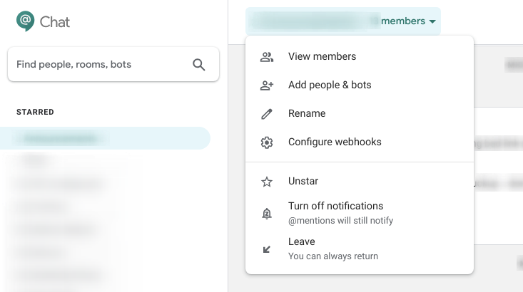
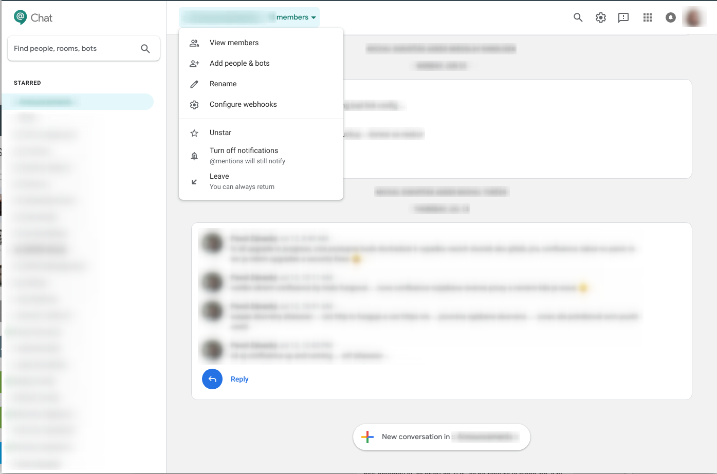
As you can see from the comparison images below, it's not a radical overhaul, although it is indicative of changes we're likely to see come to other Google properties. The search box now has a rounded rectangle outline with a new 'Find people, rooms, bots' label, the settings icon has been changed from three-dots to a cog, and a help button has also joined the menu bar. As we've seen in Android P, Google is moving towards hollowed out iconography across the board. The chat cards seem to be a bit smaller, showing more of the gray background, while the reply button is now encircled and bolder.

Above: Before. Below: after.

There is a much more prominent button for starting a new conversation and it contains the multicolored plus icon we first saw in the new Gmail's 'Compose' button. Another change that's visible is that the highlighting of which chat you are in is now colored (teal, in this case) with one rounded end, just as we've seen in other redesigned Google products.
Our tipster has blurred out much of the content, so that's about all we can say for now. We also can't be sure if this is just a test or if it's rolling out to all G Suite users, so let us know if you're seeing this redesign in your Hangouts Chat.
Thanks: Michael