Microsoft Outlook on the web is now getting the new fluent design-based icons and more
1 min. read
Published on
Read our disclosure page to find out how can you help MSPoweruser sustain the editorial team Read more
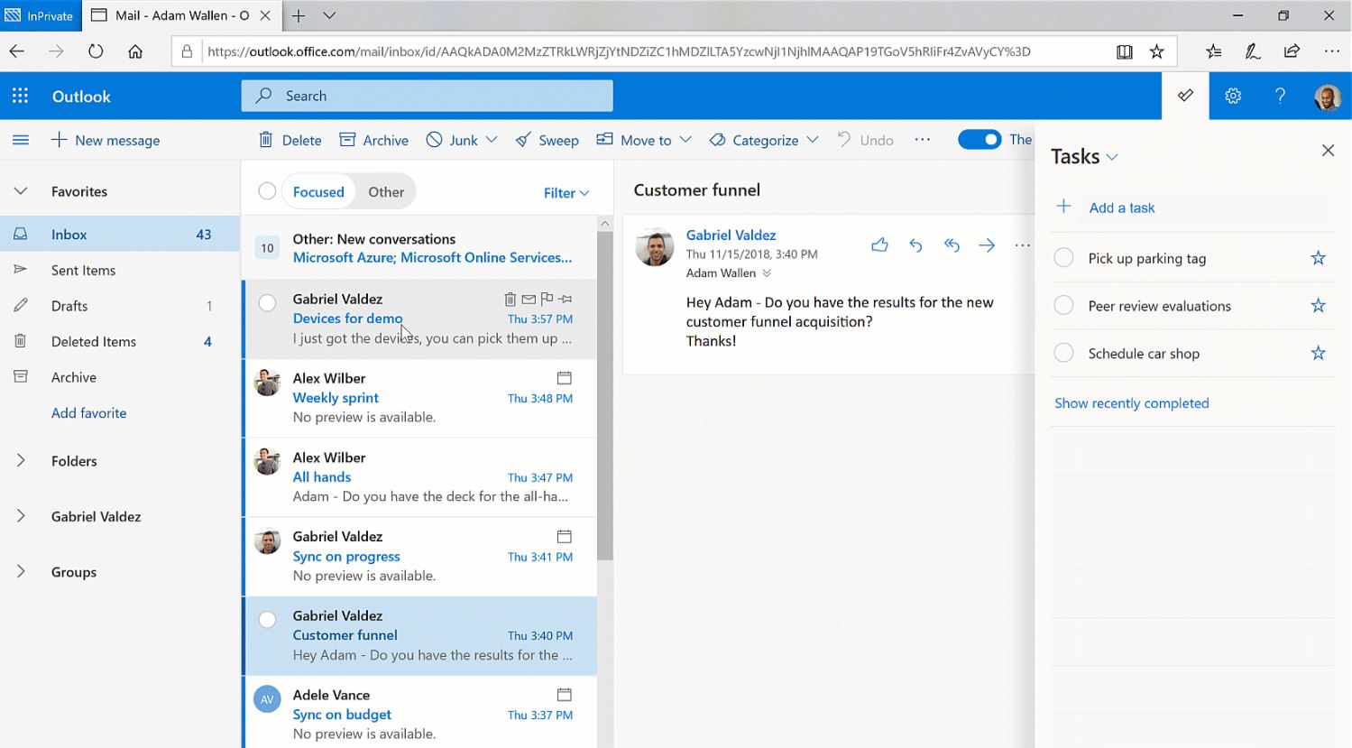
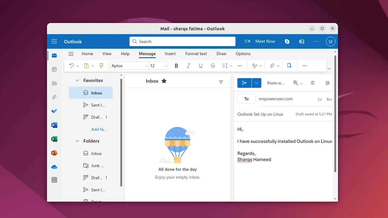
Microsoft is currently in the process of modifying the design of its email service, Outlook on the web that is Outlook.com as the company has started rolling the new fluent design-based icons, which replaces the existing icons in the main menu, to Outlook.com. Aside from that, the company is also rolling out some small design improvement. For example, the “New message” button no longer has the + sign — the button now has a colorful background color, which is very nice.
However, it appears that Microsoft is rolling the feature in a phased manner as there are plenty of users, who are claiming that they haven’t seen any changes in the Outlook.com yet. So, if you’re not seeing any changes, there is no reason to be worried about, because you’ll get the aforementioned features, hopefully, by the end of this month.
via: HTNovo


