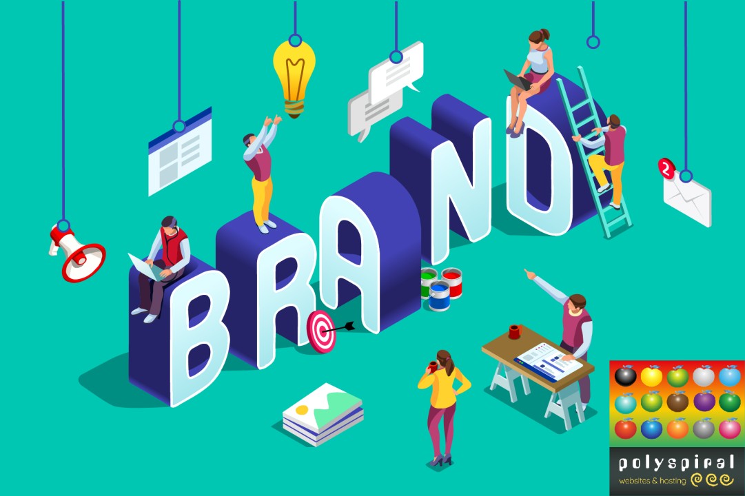
Website design isn’t just about making things look pretty, here’s why
Abbie Thoms
Multi-award winning website designer, specialising in WordPress, SEO and website hosting
People spend more time on a an attractive well-designed website.
So creating an attractive environment that's easy for people to find what they're after is of the upmost importance.
A website isn’t a piece of art, it’s design and a whole lot of functionality. Design is more than just making things look pretty! It’s about making the information easy to access or tools the website offers easy to use.
The longer people are on your website, the more compelled they are to spend money with your business or donate to your charity.
Where to start?
Before you start or overhaul your website, think about who it’s for first. It must reflect your business, so you need to be happy with it. However, put your website visitors first, what are they looking for when they visit your website! Why do they visit your competitors' sites?
Hopefully, before you had your website designed you went through a similar process as above with your logo. We design logos too, but if you want to have a go yourself try this book on how to design your own logo For the Love of Logos
Colours and fonts
Make sure the colours you use are easy on the eye. Bright colours such as magenta or bright red are used subtly and not as a background colour for the page. You don’t want to burn out your website visitors' retinas.
I mentioned fonts being consistent below, but they also need to be really easy to read. condensed and script typefaces aren’t as easy to read as serif and san serif fonts like Garamond and Ariel. You might think these are boring, however, avoid being different for the sake of it, design is meant to communicate, not be unclear and flouncy just because it’s fun, because it isn't if you're trying to read it.
When I started building websites, late last millennium, tiny square fonts were all the rage, then the fashion became huge fonts on sites which I didn’t like to start with, obviously, they are much easier to read. I'm in my mid-forties and I appreciate a typeface I can comfortably read these days.
So think about how legible your website is, you want people to read the content and gain an insight into what you do and make that all-important inquiry.
Confusion weakens, don’t mix your visual messages
Once you have your branding nailed and you have a great logo to work with, all of your web and printed media must reflect your visual branding consistently. The same design principles that apply to business cards and leaflets also apply to websites and apps.
Mixing typefaces and colours can break down the strength of your brand’s impact and reputation. So when you have your logo designed, get your graphic designer to give you an idea of typefaces and colours that go with your new logo so you don’t risk damaging your business’s reputation in a crazy mishmash of designs. You can get some brand guidelines to help keep that consistent across your company’s online and printed media.
Remember the world, not just the web and social media is a riot of colour and typefaces. Having a riot of fonts in the designs of your website and adverts or anywhere people see your brand will risk it being lost in the noise of everything else.
A strong brand stands out in the crowd and builds a stronger impression.
How do you know if the design is ‘good’?
It is up to personal taste but only up to a point with design. The best way to analyse is to ask some questions:
- Would someone in my target audience be attracted to this design, is it obviously speaking to them?
- Do I get an immediate impression of what my site is all about at a glance?
- Is it easy to access the information the site is designed to convey?
- Do I want to spend time on the site - if the colours are too bright you may not want to
- Is the website easy to navigate or do you have to think about and search for the buttons to get to what you’re after?
- Is there too much going in one place?
You might have spent so much time on the site you’ve become a bit blind to it, it happens to lots of designers. It’s always a good idea to get a second, third or even fourth opinion on any piece of design, especially from someone outside your industry who knows nothing of what you do. Make sure they’re someone who isn’t afraid to give an honest opinion, it’s no good asking your mum who will say it’s all fab.
Good design pays
Google knows how long people spend on your website, this is sometimes referred to as Bounce Rate. Sites with a low bounce rate do better in Google’s listings.
So it's worth investing time and money in the design of your website. Far from being secondary, it should be where you start and continue to improve as styles change. It can make the difference between a website that pays for itself and one that doesn’t.
If you’d like help with your website, even just impartial advice, talk to us here: Polyspiral.com or message me directly.
Helping businesses grow through ✴️ Social Media Management✴️, SEO Content✴️ & PR✴️ Boosting Your ✴️Leads, ✴️Sales & ✴️Growth, call 07956 977 994 writewai.com
2yAn interesting article Abbie. We should also mention the importance of well written SEO content for your website too.
Where do you usually work?
Retired & helping SMEs in Norfolk, Suffolk & Essex
2yGood article about website design Abbie