Why Do All New Fashion Logos Look the Same?
From CELINE to Calvin Klein, luxury houses are opting for minimal, sans-serif designs.
You are reading your free article for this month.
Members-only
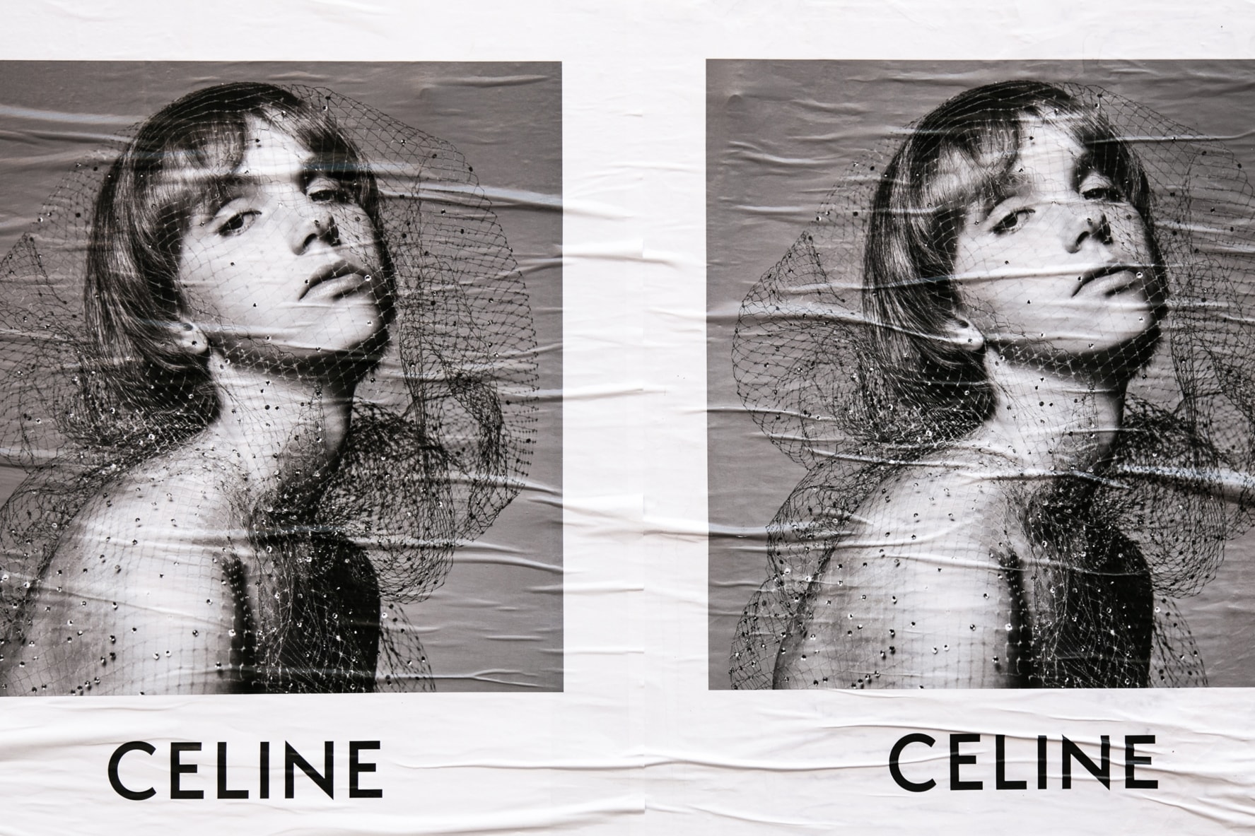
Earlier this month, French luxury house CELINE changed its logo. The accent on the ‘E’ was gone and the spacing between the letters had been tightened, all to give the new branding a “simplified and more balanced proportion,” according to CELINE. The move came ahead of Hedi Slimane’s first show for the house, and meant that CELINE became the latest brand to unveil a new sans-serif, minimalist logo.
The rebranding by new Creative Directors isn’t new. Back in 2012, Slimane dropped the “Yves” from Yves Saint Laurent and two years later John Galliano’s tenure meant that Maison Martin Margiela became Maison Margiela. More recently, Raf Simons marked the beginning of his time at Calvin Klein by recruiting Peter Saville for new branding unveiled in 2017. Later that year — almost two years into Demna Gvasalia’s time with the house — Balenciaga followed suit. Back in August, Burberry kicked off the Tisci years with an update from Saville.
There are a number of reasons why these houses have rebranded, including the chance to mark a new chapter in its history. David Rudnick, a graphic designer and typeface specialist whose previous clients include Nike as well as producers Evian Christ and Koreless, believes the new logos are a break from the past. “They’re removing the shadow of the ego that they’re stepping into, by removing the presence of the great legacy designer of the house,” Rudnick explains, pointing particularly to the move from Yves Saint Laurent to Saint Laurent.
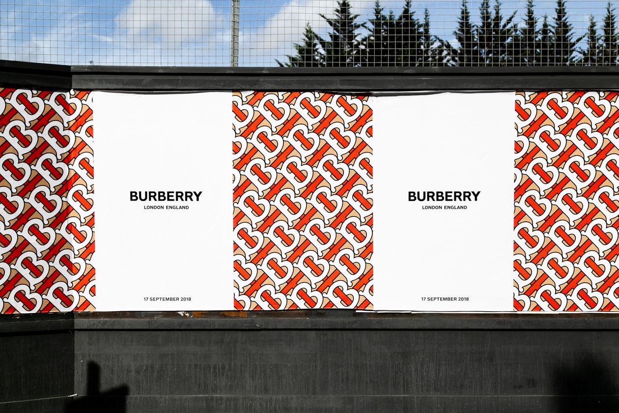
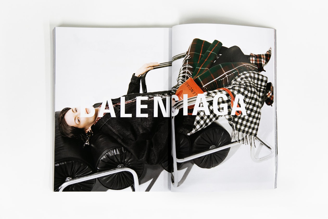
Although the founder’s name may be kept intact, Rudnick believes this process is also driving the decisions from Burberry and Balenciaga. “Balenciaga was the legacy of Cristobal Balenciaga, and his remarkable distinctive typography of that logo has been abandoned for Univers Bold Condensed,” he adds, “Burberry ceases to be grounded in any typographic styling that is recognizably British or from a heritage of English type forms.” Burberry has, instead, added the words “London, England” underneath the logo, which Rudnick believes is the house “seeking to reflect the style or positive brand associations in those two words, whilst seemingly ignoring the house’s role in creating some of those associations.”
The overall effect of these decisions is to create a clean slate for the new designer; a chance to rewrite the house’s heritage. “What’s happening is the removal of these labels as the lineage of one creative individual,” Rudnick continues, “they are transforming them into global brands.” Geo Owen, creative director of GEO and an ex-DONDA graphic designer, is aware that this process can have a negative impact. “I do feel some of these logos have lost that heritage,” he explains, “that nostalgic feeling of why we bought into the brand in the first place.”
“Branding T-shirts, sneakers and accessories is hindered by a hyper-specific, imaginative language of form.”
As well as allowing new designers to start over, the new logos also have very real commercial implications. The style chosen by Calvin Klein, Balenciaga and the rest is useful for its branding purposes. “The aesthetic of a sans-serif font sits cleaner and reads in a more legible manner,” says Owen, “you can also use the logo for many different applications and mediums like never before.” Similarly, Mitch Goldstein, a professor at R.I.T.’s College of Art and Design, sees this as the logos’ primary purpose. “I suspect that the idea behind these designs is as much about the logotype as an empty “container” that can hold the brand anywhere in any medium, as much as it is about the actual design itself,” he explains, “in some ways I love this idea, the specificity of these logotypes means that they can mean whatever the brand wants, whenever the brand wants it, wherever the brand needs to be.”
Rudnick, meanwhile, highlights why this process has become so important to luxury houses. Whereas once these companies were focused on clothes in terms of cut, style, fabric, silhouettes and their relationship to seasonality, they are now driven by a different market. “The bulk money that these labels now make is on items which no longer reflect that: T-shirts, sneakers, bags and accessories,” Rudnick adds, “branding those things is hindered by a hyper-specific, imaginative language of form.”
A further benefit for the new logos is the ability to keep the label in the news, and crank up the anticipation before the creative director’s first collection. One way that houses have managed to do this is through the choice of designer linked to the project. “It makes sense to work with a personality who will provide a promotional benefit to the reveal of the new logo,” explains Rudnick, referencing Peter Saville’s involvement on two of the aforementioned projects. “Peter Saville is uniquely positioned to provide the desired story for a rebrand of this nature; his legacy and position within the graphic medium is that of a peerless arbiter of sophisticated visual style. Attaching Peter’s name to these reveals affiliates the decisions behind them with a legacy of sophistication and care simply by benefit of the fact that it is a Peter Saville design; all the more useful if the forms of the revealed logo do not hint at this character.”
By opting to change their visual identity, brands such as Calvin Klein, Balenciaga, Burberry and CELINE are announcing the beginning of a new era. On one hand, this allows the new high-profile designers to release collections that share nothing with the visual identity created by the label’s founder, while also giving them an excuse to update the brands to the commercial realities of the 21st Century. There is a flipside to this, as the ability to wipe clear the brand’s heritage does not bode well for the current designers. When, inevitably, they are replaced, the next designer to fill the role will have no obligation to follow the new design language.

