iPadOS 15 Finally Makes Multitasking Discoverable
Confession time. I’ve never been able to remember the cryptic gestures necessary to invoke Split View and Slide Over on the iPad. In part, that’s because I find using the iPad slower and clumsier than using the Mac, so whenever I might need Split View, in particular, I just switch to a Mac. If I can’t remember these gestures among the myriad other bits of Apple tech trivia that fill my brain, I have to assume that people less enmeshed in their Apple devices can’t either.
I don’t know that iPadOS 15 will cause me to do more of my work on the iPad—the apps I need just aren’t equal to their Mac equivalents—but I’m thoroughly pleased by Apple’s changes to multitasking. Most notably, you no longer have to remember arcane gestures!
iPadOS Multitasking Views
First, a quick recap: if you haven’t been able to remember the esoteric multitasking swipes, you probably don’t remember what views they enable.
- Split View lets you put two apps—or two windows from the same app—onscreen simultaneously, with a black divider bar whose handle you can drag to change the percentage of the screen devoted to each app. Split View is useful when you need to work in one app while referring to content in another or when transferring data between apps.
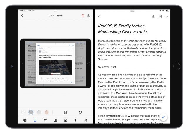
Split View showing PicSew (left) and Google Docs (right) - Slide Over positions an app—or a stack of apps you can swipe through—as a floating window on either the right or left edge of the screen. A swipe to the edge of the screen hides it, and a swipe from that edge reveals it again. You can also drag it (from an edge of the window) from one side to the other and swipe between multiple Slide Over apps using the bar at the bottom. Slide Over is helpful for a quick reference to your calendar or to-do list or for maintaining a Messages or Slack conversation while working on something else.
Slack in a Slide Over window above Google Docs - Center window, which is new to a few apps in iPadOS 15, centers a single app window on top of the current full-screen app. Center window can be helpful for viewing or editing a particular message in Mail or note in Notes without changing the background context. For that, it relies on the new shelf, described below.
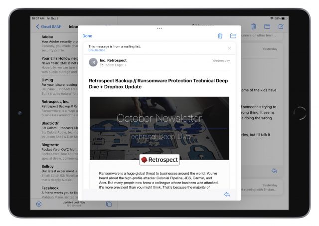
Email message in a center window above Mail

In what we can hope is an acknowledgment that gestural interfaces suffer from discoverability and memorability problems, Apple added two new visible interface elements to expose multitasking options—the Multitasking menu and the shelf—and radically changed the App Switcher to facilitate multitasking. Here’s how you use these features.
Change Views with the Multitasking Menu
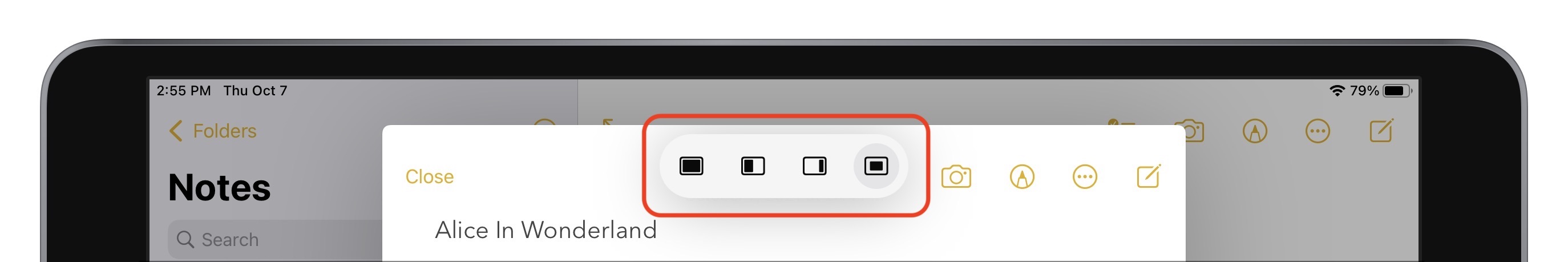
The most significant improvement to multitasking in iPadOS 15 is the new multitasking ••• control that appears in the top center of every window, whether it’s in full screen, Split View, Slide Over, or center window.
Note that when you’re in Split View, the multitasking control in one of the Split View windows features a gray border (below left) that indicates which of the two views is active—in other words, which one will receive keystrokes if you start typing.

Tap the multitasking control to reveal the Multitasking menu, which has three (or four, if you’re in a center window) icons. The icon with a gray circle around it indicates the current mode you’re in (above left, showing Split View). Tap one of the other icons to put the current app into that mode. From left, they are:
• Full Screen: The most common scenario is that you’ll tap the multitasking control when only a single app is showing. In that situation, the full screen ![]() icon is selected, and you can tap the Split View
icon is selected, and you can tap the Split View ![]() icon or Slide Over
icon or Slide Over ![]() icon to put the current app into those modes. When you have an app in Split View or Slide Over, tap the full-screen icon to make that app take over the entire screen.
icon to put the current app into those modes. When you have an app in Split View or Slide Over, tap the full-screen icon to make that app take over the entire screen.

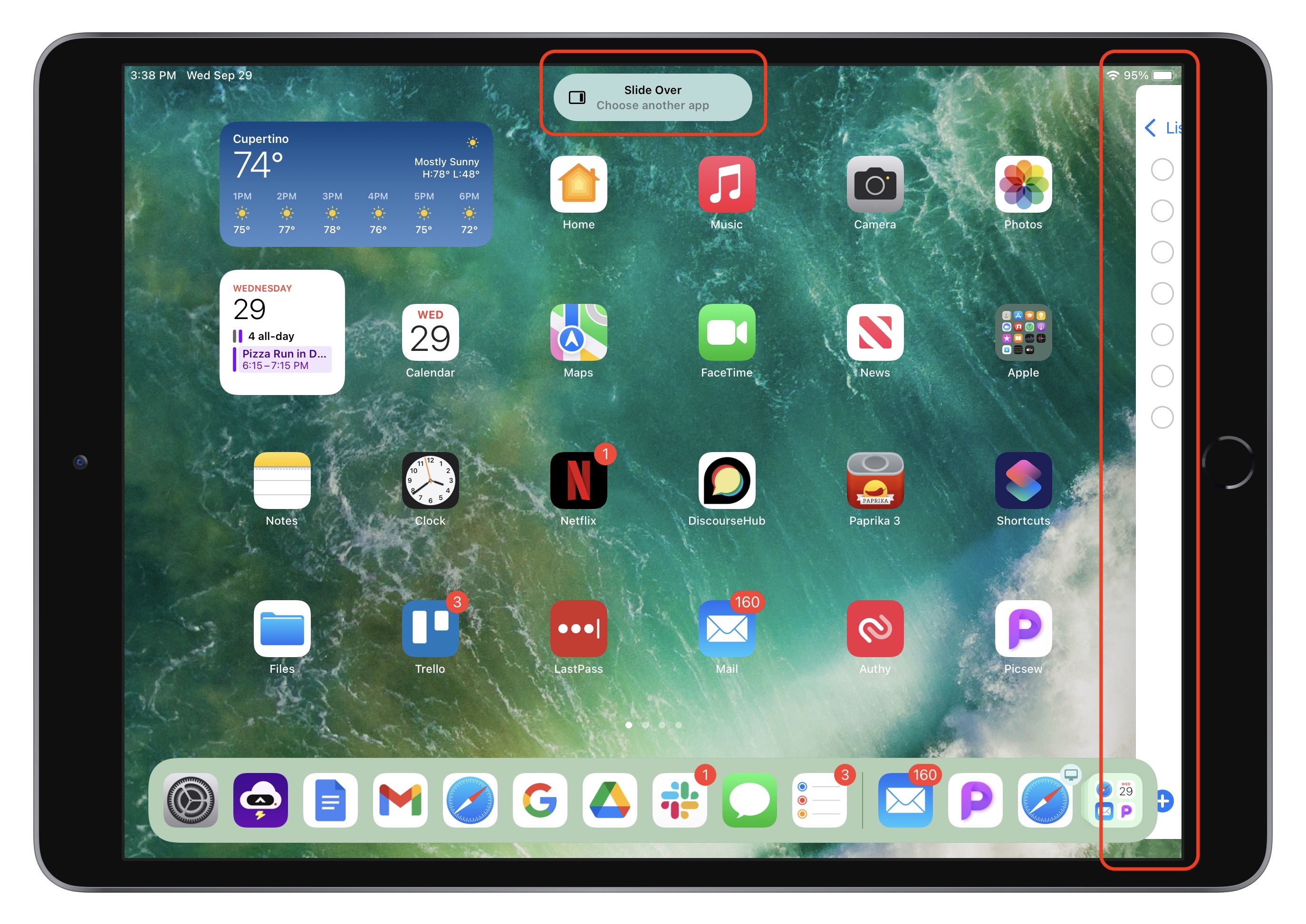
• Split View: To put the current app into Split View, tap the Split View ![]() icon to shove the current app to the left edge of the screen, revealing the Home screen and the Dock. A little lozenge replaces the Multitasking menu, telling you that you’re working with Split View and to choose another app. Tap any other app to open it (on the right side) with the current app (on the left side.
icon to shove the current app to the left edge of the screen, revealing the Home screen and the Dock. A little lozenge replaces the Multitasking menu, telling you that you’re working with Split View and to choose another app. Tap any other app to open it (on the right side) with the current app (on the left side.

• Slide Over: Tap the Slide Over ![]() icon to push the current app to the edge of the screen where you last positioned the Slide Over window. Again, iPadOS reveals the Home screen and Dock and shows a lozenge that tells you that you’re working with Slide Over and to choose another app. Tap any other app to open it full screen, with the current app floating above it in Slide Over mode.
icon to push the current app to the edge of the screen where you last positioned the Slide Over window. Again, iPadOS reveals the Home screen and Dock and shows a lozenge that tells you that you’re working with Slide Over and to choose another app. Tap any other app to open it full screen, with the current app floating above it in Slide Over mode.
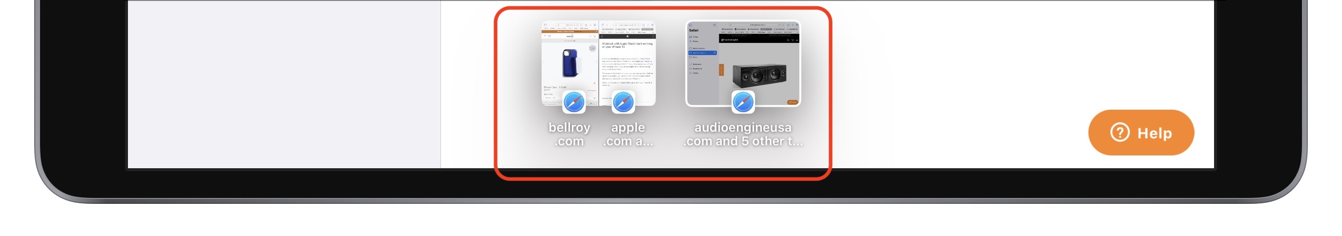
Manage Split View and App Windows with the App Switcher
The next multitasking-related problem that Apple tackled was the inability to see which Split View combinations you had created and switch among them. The key word there is “switch”—to that end, Apple significantly enhanced the App Switcher, accessed by double-pressing the Home button or swiping up from the bottom of the screen. It provides a plethora of multitasking-related options:
- Switch among apps and windows: Tap any app, Split View combination, or Slide Over window (located out of sight to the right of the App Switcher) to switch to it. Note that if you open the App Switcher while viewing an app and then tap a Slide Over window, the Slide Over window displays over the current app. However, if you open the App Switcher from the Home screen and tap a Slide Over window, it opens both the Slide Over window and the last app to which it was attached.
- Make a Split View: Drag any app or window onto another one to combine them into a Split View.
- Replace a Split View app: Drag any app or window onto the left or right side of a Split View combination to replace that app or window.
- Break a Split View combination: Drag the left or right side of a Split View combination off until it displays as a full-screen thumbnail.
- Turn an app into a Slide Over window: Drag any app to the right side of the screen where the Slide Over windows live and release it once the dragged app becomes a skinny rectangle.
- Turn a Slide Over window into a Split View: Drag a Slide Over window over a full-screen app or over one half of a Split View combination. (You can’t convert a Slide Over window to a full-screen app, but you can drag it over another full-screen app to create a Split View and then drag that half of the Split View out to take it full screen.)
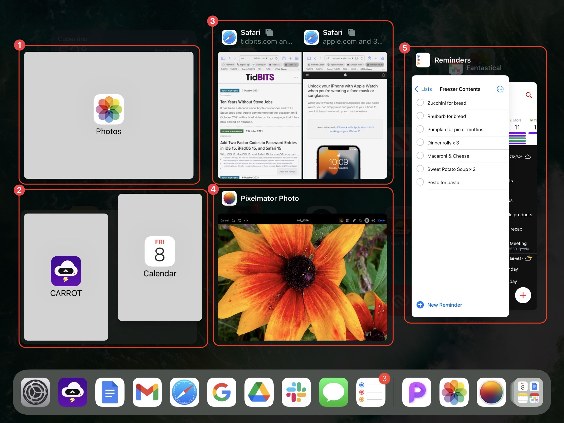
2: Creating a Carrot/Calendar Split View by dragging Calendar onto Carrot
3: A two-window Safari Split View
4: Pixelmator Photo as a simple full-screen app
5: Reminders and Fantastical in Slide Over windows
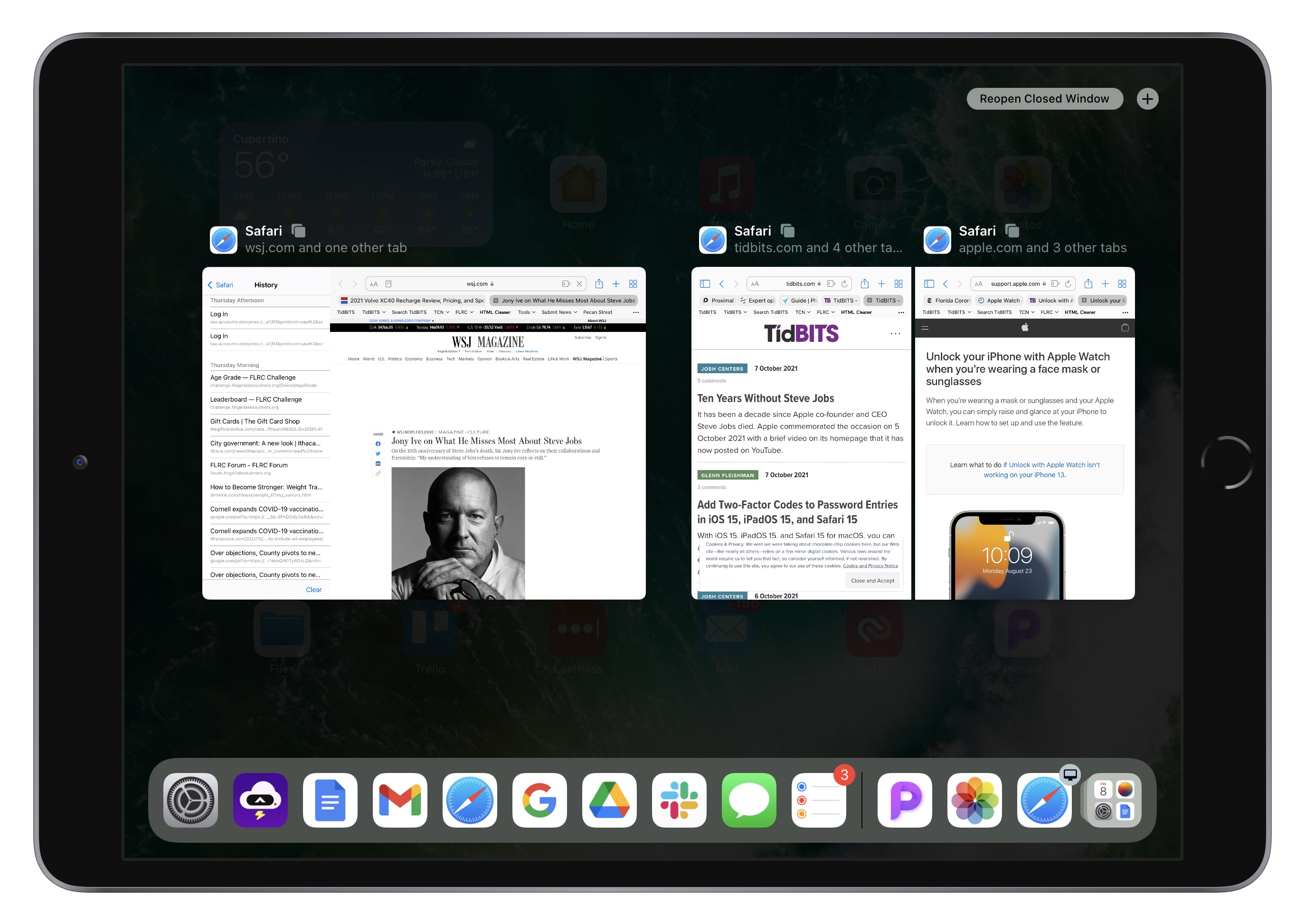
In Callout 3, note the little stacked square icons next to the Safari Split View windows. Those indicate that the app in question has multiple tabs or windows. Tap the icon to display just that app’s tabs or windows in the App Switcher.
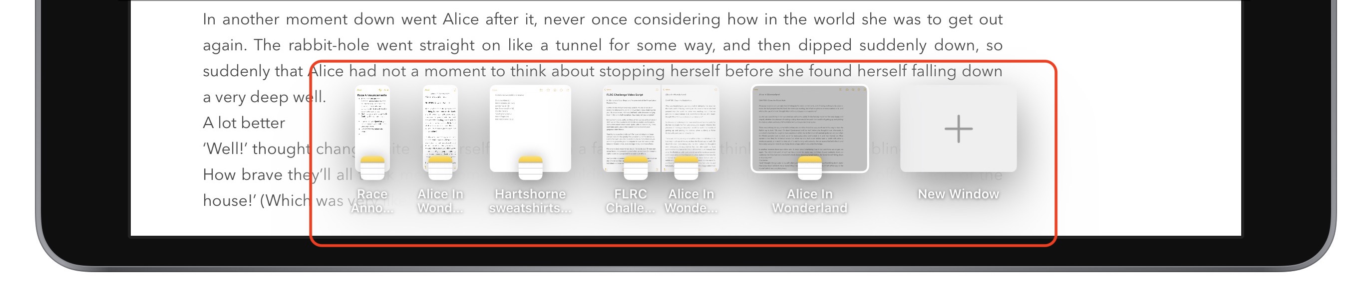
Switch Windows with the Shelf
Although the App Switcher gives you some visibility into open windows in an app, another new multitasking feature, the shelf, is more useful for managing multiple windows for a single app. When you use the Dock or a search to open an app with multiple windows available, the shelf displays them all at the bottom of the screen. The shelf doesn’t appear when you switch to an app using the App Switcher or four-finger swipe, but you can bring it up at any time by tapping the multitasking control at the top of the screen. In a Split View combination, each window gets its own shelf.
When you’re looking at windows on the shelf, tap one to switch to it. You can also swipe up on windows on the shelf to close them. As soon as you tap anywhere else in the app to start working, the shelf disappears.
You can end up with some rather odd collections of thumbnails on the shelf. While writing about center windows in Notes, I found myself with thumbnails for full-screen windows, Split View combinations, center windows, and Slide Over windows. Switching among them resulted in some non-intuitive combinations and situations. There may be bugs here, but I doubt anyone will put the necessary effort into figuring out where it’s behaving confusingly or incorrectly.
A Few More Words about Center Window
As I mentioned above, center windows are a new addition to iPadOS’s multitasking options. In apps with content-centric sidebars, such as Mail and Notes, you can now open an item like a message or a note in its own window in the center of the screen. (Those are the only apps I can find that support center window mode; there are undoubtedly others I don’t have.)
Center windows are somewhat useful for previewing the full content of the item. But the real win comes when you swipe down on the center window’s multitasking control to put the window on the shelf, thus keeping it available for quick reference. Remember that you can tap the multitasking control at the top of a normal or Split View window (not a center window) to reveal the shelf and then tap a thumbnail on the shelf to open a window.
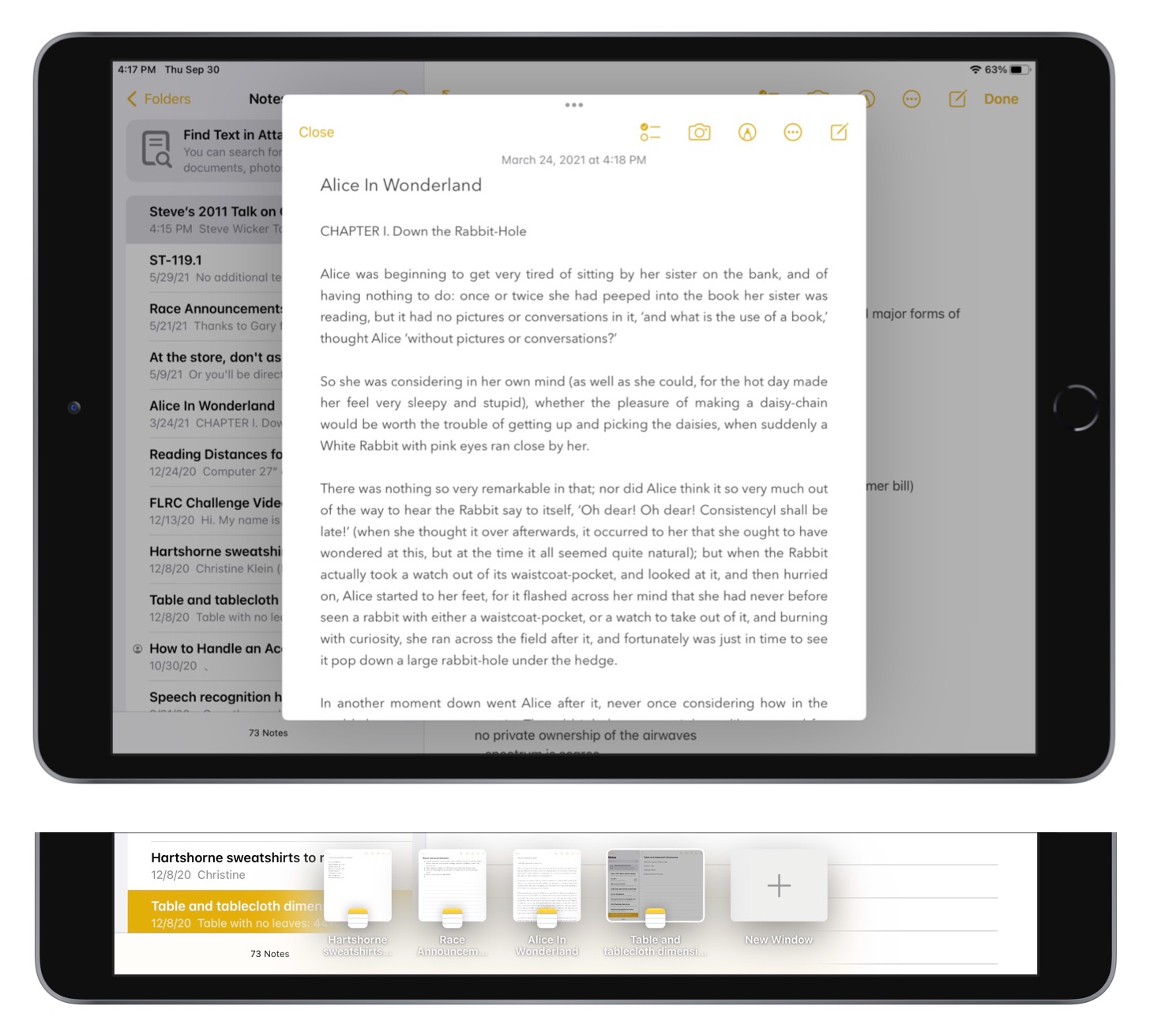
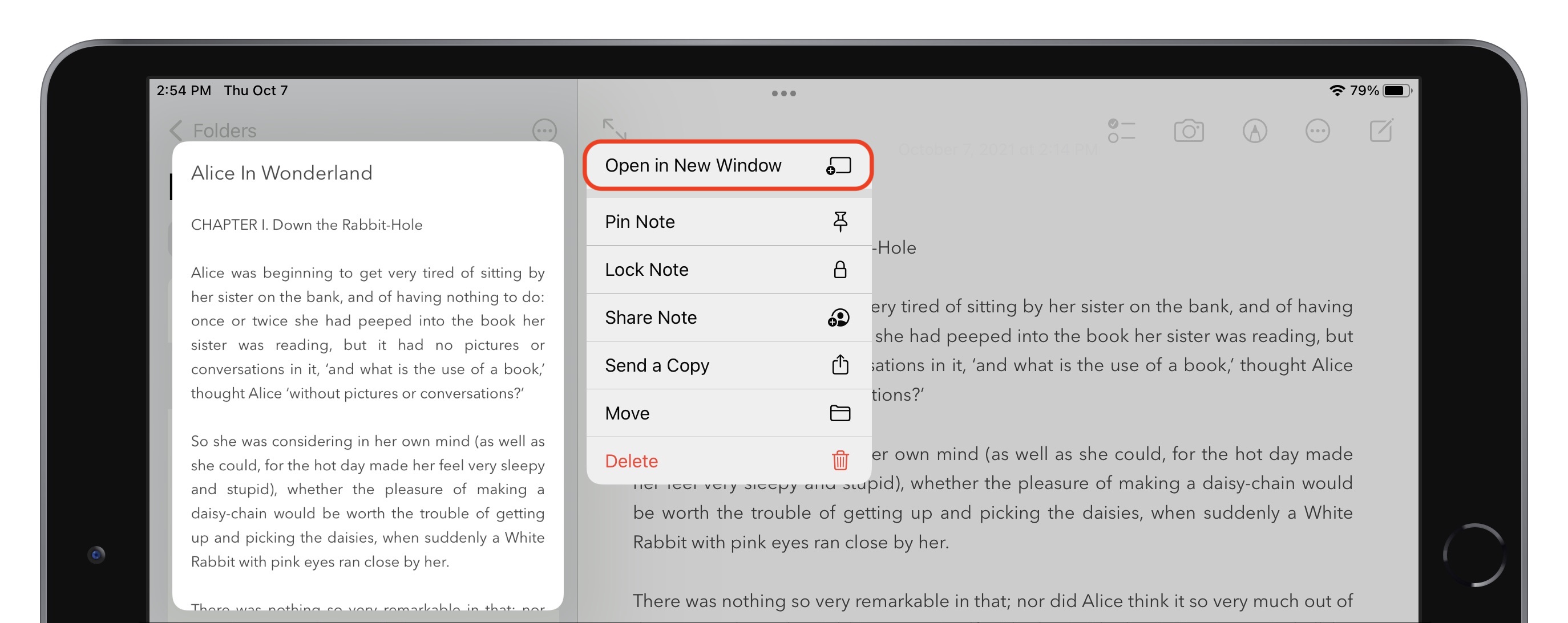
To create a center window, touch and hold the item in the sidebar and then tap Open in New Window from the menu that appears. Mail also creates center windows by default when you begin composing a new message. To close a center window, tap Close or anywhere outside the window. You might think you could swipe up on a shelf thumbnail to open it, given that swiping down adds a center window to the shelf, but swiping up on thumbnails closes the window as well.
If you tap the multitasking control in a center window, you’ll see that a new fourth icon is selected, indicating that it’s a center window: tap one of the other icons to make the window full screen, put it into a Split View, or make it a Slide Over window.
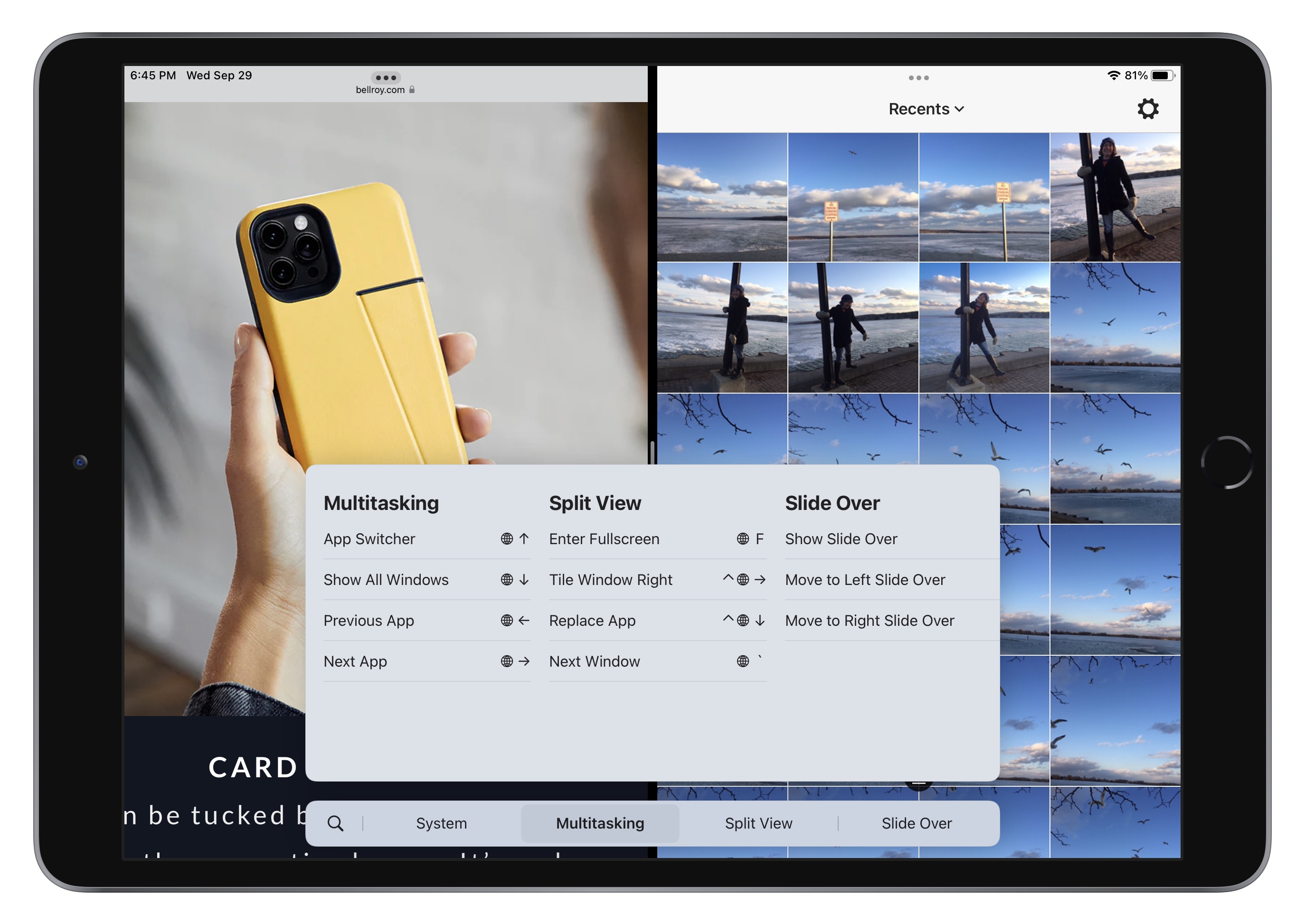
Keep Your Hands on the Keyboard with Multitasking Keyboard Shortcuts
If you’re seriously interested in using multitasking on an iPad, you’re probably also working with a physical keyboard much of the time. In iPadOS 15, Apple added a useful set of keyboard shortcuts that you can learn about by pressing and holding the Globe key and then tapping the Multitasking tab at the bottom. It may take a little while to internalize the shortcuts, but if you do most of your work on an iPad, you will probably find the effort worthwhile.
In an interesting mashup of keyboard and touch interfaces, you can also tap the keyboard shortcuts (or click them if you have a trackpad or mouse attached) to invoke them, making it functionally similar to macOS menus.
Once you’ve upgraded your iPad to iPadOS 15, I encourage you to give the new multitasking interface and features a try. Although I remain skeptical of center windows, and I doubt I’ll ever be a serious enough user of iPad multitasking to use the App Switcher heavily to manage Split View combinations, the new Multitasking menu and shelf are extremely welcome additions to the iPad experience.
I hope Apple is reviving discoverability and user testing; I never let my late mother upgrade to a MacOS version in which the green button entered full-screen mode with no obvious way to return to normal. She understood the well-designed Mac UI, but would never have been able to cope with that. I’ve known an experienced Mac user with a doctorate in a real science to need my help escaping from Undiscoverability Hell, and one with a doctorate in a dismal science to get lost after iOS updates.
iPadOS Split Windows have been more than a mess for me. Despite nearly 40 years spent absorbing the Apple way of thinking about interfaces, I could never, never remember how to invoke a split window. But occasionally I could do it by accident, at the very moment I did not want one, and then for real spend minutes of my life trying to get rid of the unwanted window. It was a straight-up interface failure. I’m very encouraged by the inclusion of actual controls for multi-tasking, even if the highlighting in the screenshots still looks distressingly low-contrast. My hope: someone, someday, is going to persuade Apple that a 9% grey tint is a minimum limit rather than a maximum limit.
Had nightmare with iOS 15.0.1 update this weekend. Too many “on by default” features I could do without, the long time for the download, verify, install, verify and then find I lost several gigs of space. Worst was I usually offload my picts via Preview. Well, Preview on my Catalina MacMini (last OS it can take) has an error on launch. Never was there. Yet, it imported all the images to a select drive. And after crashing twice. I was able to go in and delete past years of already backed off movs and images.
Thanks Apple. Your iOS now means I need to get a larger capacity phone and presumably means latest (I’m running an 8 and will wait for 12Pro refurb). Next up, the iPad (which is not a critical tool like my iPhone). So I will see how its with multitasking.
Does anyone at Apple know what Accessibility is and that a hairline update progress what shows faint pulsing of greys…is not ideal? Or that turning on “features” that weren’t on, is not desirable? Focus…I don’t like it. What I want is, any text message (SMS or otherwise) to go to unknown. Not show up at all and let me decide that yes, its junk, and not a contact. Or that an unknown + URL is not wanted. I want that option. Anyway, off to take iPad to iOS 15.0.1 (oh, if this needs newest iPad…).
And now there is a 15.0.2 out!
Thanks for the detailed explanation of how this new feature works. Now I know enough to want to avoid it. Think I’ll stick to my Mac.
Hoping that’s not because of my post above.
I was responding to the miserable “have to remember inscrutable gestures and that they exist” experience that was present before iPadOS 15.x.x was released.
The newly released interface that includes actual controls sounds like it will make multitasking a useful addition to the iPad experience.
Perhaps Apple can use this as an example, and work their way back through all the other things they have made undiscoverable. /dream
This ‘feature’ has been so bad that I have resorted to restarting my iPad when I accidentally triggerred one of these monstrosities. And there are plenty of other features that require exploratory screen stroking in 45° increments from all possible corners and edges, with every possible number of fingers and gestures. As Douglas Adams said back in the dark days:
One annoying factor is only certain apps remain usable in split screen or slide over modes.
For example, I noticed the Settings app is not able to use these modes. Which can make checking things a PIA.
I’m not sure there are all that many such hidden iPad gestures that are the only way of doing something, as was previously the case with multitasking. In most cases I can think of, like swiping right with four fingers to move back to the previous app, that’s just a shortcut to one of many ways of switching to apps, such as double-pressing the Home button on a Touch ID iPad to open the App Switcher or simply pressing it once to return to the Home screen and then using the Dock or a Home screen icon to switch to the other app.
So let’s make a list. What gestures have no onscreen or physical reminder and are the only way to invoke some action?
While this new thing is WAY better than the convoluted mess they had before, I could not seem to get it to do a split in landscape (was trying to do text & watch a football game!). That it can not do that leaves the cleanup simply lacking.
I share Matt’s pain. I keep getting a fly out screen whenever I touch the screen near the right or left side of my iPad Air’s screen. Then I have to stop what I’m doing and futz around to get rid of it. Is there any way to shut this off?
Not any more with iPadOS 15. However, if you have a slide-over item showing, you’ll notice a horizontal bar, like the home bar on a Face ID iPhone, on the bottom. If you swipe up and hold as you would on a Face ID phone to show the multitasking screen, the iPad will show a version of that for the apps that are set up to slide over. You can swipe up on each of them to delete them from the slide over area, and when all of them are gone, there will be no more slide over items to show when you swipe in from the edge of the screen.
This is a great undocumented gesture! Thanks for that.
Rather than focussing on the gestures, lets look at the functions.
Anything on IOS requires either poking an icon in some way, poking some text that might be a button or link, or using a gesture of some kind.
Icons and text are discoverable as long as they are visible — if they disappear (as is the current fashion) rather than greying out, the existence of the function is not findable.
Gestures — especially ones with multiple digits — are inherently obscure, so they should be extremely consistent, and reinforced with text that shows what they are doing. Or, help should pop up when you do something often using buttons, suggesting a gesture. Nothing should be left to only gestures, unless there is text to indicate that at first (‘swipe right continue’).
This applies to various versions of iOS, iPhones and iPads — which is part of the problem. Things which worked, stop working, and there is no way to find them again.
So, with that rant out of the way, here is a short, incomplete and imperfect list. They mostly represent actions that I or people I know have not been able to perform, or have only been able to perform by a circuitous route, or have only found by accident and not found again. Some are still subject to ‘stroke the screen randomly and hope; if all else fails, restart’.
And before anyone jumps in: yes, for most of these a Google search will find results that might work on the iOS/device combination in question. But “search Google” ≠ discoverability.
I think there are two types of gestures that you’re identifying here, those that would be used infrequently enough that people would have trouble remembering them (like the old multitasking gestures) and those that you use so frequently that they’re easily picked up. For instance:
This is an entirely valid criticism, although it’s not like any help system has ever really been successful. Remember balloon help?
Apple has tried several times to come up with an Undo, but it’s so infrequently needed and so inconsistently supported that nothing has caught on. I try the shake to undo periodically, but it’s very hit or miss. And there’s some sort of multi-finger swipe when editing text, but I’d have to look it up because I need it so infrequently that it doesn’t stick.
I use Gmail, not Mail, but when I pulled up Mail just now, the search field showed at the top of the All Inboxes screen.
A better example of this would be search in Settings, where you have to know to pull down when at the top of the screen. And it works poorly even then.
This one doesn’t bother me—I use it all the time so swiping down from the center of the Home screen is total second nature.
Again, Control Center is something that I’d expect people to use enough that they’d remember the swipe down from the right corner (or whatever it is on Touch ID iPhones).
That’s entirely deserved criticism, and I have no idea why Apple doesn’t put an Edit button at the bottom of Control Center to open Settings > Control Center. There’s plenty of precedent for that with Today view and Share sheets.
That doesn’t bother me—it’s not something people need to do hardly ever, so they can look it up if they forget that dragging one thing on top of another works.
Eh. The frequency and liability from this mistake is so low that I wouldn’t waste much effort on enabling it. In theory, if Undo support were consistent everywhere, it could be added, but whatever.
I’m not sure what this means. If you’ve enlarged something by pinching out, pinching in would seem to be reasonable to reverse it.
Generally speaking, I see controls when I tap the screen and one of them is often an X.
I can’t say I’ve never wanted to stop audio, but as far as I can remember, whenever I have, there’s a clear Play/Pause button.
You swipe down from the top left to get Notification Center; swiping up puts it away. That seems reasonable. And while you might not guess it, it’s also only a secondary approach for revealing it since all that stuff appears if you swipe up on the Lock screen too.
You mean when you’ve invoked the camera from the Lock screen? That does feel like an error on Apple’s part to me, since swiping to the left on the bar at the bottom of the iPhone screen should work, but in fact only swiping up returns to you to the Lock screen.
Just like App Library, that doesn’t bother me too much. Ideally, Apple could add slightly different dots that indicate Home screens
Do you mean the App Switcher? Getting into it is funky with that swipe up and slightly to the right, but getting out of it seems obvious—just tap the app you want.
Not sure what you’re referring to here.
That doesn’t much bother me. Tapping something to make it expand or become editable seems reasonable. And you can press and hold in the text to move the cursor. Trackpad mode invoked by pressing on the Space bar isn’t discoverable (a tiny icon there could help!) but if you’re likely to use it, you’ll remember it easily.
This should not be made obvious in the UI—it’s a last-ditch troubleshooting feature and making it more obvious would encourage people to work against iOS and hurt their performance and battery life.
And that’s what the new multitasking UI does.
I do this often enough that I know it’s double-tap with three fingers. Shake to undo is a cute gesture and not terrible on an iPhone, but kind of silly on an an iPad.
Shake to Undo inspired by Etch-a-Sketch?
Thank you. I couldn’t figure out why I sometimes got the App Switcher and sometimes didn’t. I wasn’t including the “right” intentionally, just haphazardly (I assume).
I do use Mail, and I often have trouble with its search function not finding what I want. Once, after Mail failed to find something that I knew existed, I hunted it down and had it on the screen and again told Mail to find it. Again Mail failed. I don’t know what the problem is, but Search in Mail needs work. Fortunately for me, I rarely Search, but when I do, I am frequently disappointed.
This 100%. Talk about something that would actually make a difference.
These days I sometimes find myself actually going to the gmail web interface to search my work mail because local Mail.app search is so bad in comparison. Obviously, I don’t expect Apple to do search as well as Google, but could they at least try?
Well, swiping up and to the right didn’t work. But it did cause me to investigate further and try to note just what I did that succeeded. For me, what seems to work is to swipe up quickly and then slow down or even stop without lifting my finger. Hope this helps someone.
Apple has documentation that tells you how they designed it to work.
Ah! Good to know—I guess my “up and to the right” simulates the pause while moving to the right.
I feel smart for having (eventually) figured out how to make it work, but I would feel even smarter if I had read the documentation. Really, I used to do that, back when there was paper documentation. (Too often, electronic documentation takes me in circles.)
This may or may not be the right place to ask this question but here goes: I have an iPad Air 2. I realize that I won’t be able to use all the new functions of iPadOS 15, but will hurt if I upgrade from iPadOS 14.8? Should I up grade for security reasons or will it brick my iPad? I would love to easily multitask on it. If I really feel that I need to multitask, I use my Mac.
Thanks for the thoughtful reply.
I agree on the first category: there are functions which do exist, would be used infrequently, but are either not discoverable or not memorable; so they might as well not exist (except for that tiny fraction of users who will go searching for documentation).
The other half is really the guts of the problem: there are functions which would be used frequently but are not used at all, because the interface obscures them. So, they are not easily picked up. Eg several of the people who contributed to this list had decided that a particular feature just didn’t exist in iOS — eg “you have to open mail on the laptop to search for things.”
As someone that people come to with questions about iOS, one of the most frequent is ‘how do I go back to how it was’.
So, I think undo of this type is actually frequently needed. But because Apple did not force it to be implemented even in its own software, users gave up. This is part of why people do things like force-quitting apps, and restarting the whole device.
Interesting. I just tried it on my iPhone and iPad; on both, at the All Inboxes screen, Search only appears if you pull down past the first item. Maybe it is device or version dependent.
Once I had accidentally discovered ‘pull down to search’ in mail, I try it randomly in other situations where search might exist. This is how I discovered Search in settings. So in this particular instance, a small amount of interface consistency worked as a discovery tool. Perhaps that was Apple’s intention; or maybe it is accidental.
Once discovered, it is a simple enough gesture to be memorable. So, 1/10 for discovery; 9/10 for memorability.
If people don’t discover it, they do not even know it exists. So, they go to the Home Screen, open Settings, and scroll through. Erk.
Except it doesn’t always work: (sometimes?) there is some combination of dragging and pausing that is required, otherwise it pushes the other apps along and drops the dragged one there. And then there is no (apparent) way to undo that.
I disagree. Because dropping pushes all the icons along - including onto the next screen - and this is not undoable, the liability is high. So I just gave up trying to organise the screens. Maybe this is Apple’s intention.
Perhaps that is the actual confusion: notifications appear because you did something (we often don’t know or remember what our last action was, particularly if it was accidental); but then it is not at all clear whether to swipe up or down to undo this.
Strong disagree. Unless there is a way to ‘go back’, force quitting an app is the only way out. ‘Working against iOS’ is inevitable when iOS is working against the user.
For each particular issue, like the ones I listed, there is often a solution of sorts; or even a reason for the current behaviour.
Some sort of consistency in gestures would help: eg pinch out might mean enlarge, or paste — perhaps that depends on the number fingers, who knows?
But overall, I am disappointed that Apple has gone so far backwards over the last few years in terms of users being able to actually find and use features, even as those features and their underlying hardware and software have got so much better.
The new multitasking UI is a small but commendable example of a step back in the right direction.
I think the new Quick Note feature falls into this category.
(Apple continues to add functionality to Notes but I still find myself not using it. I should probably experiment with it.)
How is this different from hot corners on MacOS?
Some functions are just something you learn about from some sort of investigation - probably mostly hearsay (e.g., somebody may watch you tap the heart icon on an Instagram post and explain that you can just double-tap the photo to like it), but for Apple’s OSes, some of us watch the WWDC keynotes where a lot of this is introduced and:or actually read the documentation.
If there was an on screen prompt for every single possible action we wouldn’t see anything else.
I’m not sure that’s the same thing. Hot corners are a simple gesture that allow you to do something you normally do in other (well documented) manners. It’s a convenience thing—AFAIK they don’t include critical functionality. And best of all, if you just browse Sys Prefs you’ll learn about it all on your own. But where would I browse iOS to learn that I have to scroll above and beyond to find search (to just use a simple example, there are certainly others and likely better ones too)? On iOS I get the impression that hidden gestures are often the primary way to do something in a reasonable fashion. I usually know these gestures, but I wonder how many regular users are aware and how they’re expected to learn about all this considering how hidden some of it is. I’m not saying iOS is bad or doing it wrong, but I believe I see substantially more “secret handshake” attitude there than on macOS. Perhaps indeed because hiding things is the only way to leave enough space for content. But even if that’s true, it leaves me with a kind of feeling of “ok so then they need to invent something new that really solves this issue because this cannot be it”.
This particular item isn’t, but a lot of these items (including swipe from bottom right for Quick Note) are in the Tips app. And the tips app is offered to everyone when they first update to a new major release of iOS or iPadOS, or set up a new device.
And this is the problem in a nutshell.
I can eventually learn an arbitrary gesture like this (and the App Switcher is one I use all the time, so I have internalized it), but spatial symbols are just freakin’ difficult to learn in a block.
I suspect this is one of the reasons that Steve Jobs ordered Newton to die when he returned to Apple (that, and bleeding beige-colored money). Newton was a gesture-based interface, and when I was 25 years younger I could sort-of pick up what I needed to know to make it run. Today, not so much.
If I need to know how to bring up another window, split one, or otherwise manipulate the interface, and one answer is to “find this button and tap it,” I’ll know the next time that there is a place on the screen where there is a button that does what I need.
Being told “[put your finger somewhere along the bottom and] swipe up from the bottom edge, pause in [the place where you think] the center of the screen [is], and then [when the time feels right] lift your finger” is so vague that it takes several trials to get it right. And if I miss just once and the interface doesn’t behave the way I expected, as a user I can be expected to lose confidence in what I thought I had learned.
Hand-eye coordination is all about targets. Just sayin’.
This is true. Another aspect is that the pens were very easy to loose and to break. They weren’t cheap to replace.
I suspect that Steve also realized that the pen dependent Palm Pilot was wiping the floor with Newton. It had a smaller and easier to handle form factor. And I suspect he had iPod and iPhone in back of his mind.
Indeed—there’s no question that touch interfaces suffer from discoverability problems. The tradeoff is that, particularly on small screen devices like the iPhone, it can be really, really hard to make them discoverable without drastically reducing the amount of screen real estate that’s available for actual use.
Interesting! I’m in much the same boat in terms of people asking me questions, and I’ve never had anyone ask about Undo.
Curious! I wonder if there’s a state issue in play, since now I’m seeing what you are, where the Search field appears only after scrolling. It does appear with nearly any scrolling and doesn’t need the same sort explicit action that I’ve seen in other places, so perhaps inadvertent scrolling made it appear before.
Arguably, the widgets in the upper-right corner are the reminder—swipe down for Control Center and you get more battery info, more Wi-Fi controls and so on. So I think that is discoverable, though because it came after the widgets, people may not think of them like that. In essence, they learned those widgets were static. And I will say, Apple made a big deal of Control Center when it came out, so there was plenty of coverage.
Agreed that it’s fussy—I think folders are a somewhat failed UI approach in iOS. The App Library and Search are more effective.
I cannot think of a situation where force-quitting an app because I did something and couldn’t get back would have made any sense at all. But then again, I’ve never found Undo to be necessary for anything other than the occasional text mishap. Force-quit should be as hidden as possible because you shouldn’t ever be doing it unless an app is truly frozen. Using it as a way to simulate Undo is the best way to lose data in iOS, something that’s normally very, very hard.
I suspect there is consistency here, but without sufficient usage, we’re still not going to remember. I always tap in text and then tap Paste rather than using the gesture since I can’t remember it. And I can’t remember it because I need it maybe a few times a month, compared to many times per day on the Mac.
But here’s a suggestion. (Not that Apple will listen, but whatever.) What if there was a help mode that could be invoked (with Siri too) that would show faint ghost outlines for gestural reminders available on a particular screen. Then you could see what was available before turning it off again. The argument against this is of course the fact that balloon help was a failure.
It certainly isn’t discoverable, but I think it falls into the category of being a shortcut to start with. You can always just switch to Notes and create a new note instead. And no, I don’t really use Notes either.
Yes. I was forever paranoid that I would lose that little piece of plastic. It’s still slotted into the MP100 that is in my closet/Museum of Abandoned Apple Tech. (Safely ensconced in the black carrying case whose brand name I forget at the moment but it included a little turtle toy to keep the MessagePad company.)
I later went through three Palm Pilots, including one that was a clone, because the entry price was so much lower (not to mention they were available and Newton was dead) and the gestures were mostly easy to understand. I even learned the weird proto-alphabet that Palm used for text entry, which was much faster than Newton’s cursive handwriting recognition and (to keep this relevant to the topic) took place in a context that was simple, repeatable, and had some relation to the outcome I wanted.
Which brings me back to my point: If you ask a user to draw an inverted V when they want the letter “A” to appear, that’s learnable because it’s not entirely arbitrary. If you ask them to imagine pulling a non-existent handle to an undefined point on the screen and it might or might not work, your interface has failed.
Which is why I like having a small widget on the screen that shows the user both that a multitasking operation is available, and how to accomplish it.
Well, once again, there’s a surprise. I did not know and did not care that there might be a Paste gesture. Tap and hold until a contextual balloon comes up, and then Paste, is what I have always done. And I’m with you—I don’t think I’d remember a gesture, either.
I think the desire for an Undo function comes from MacOS usage. Back to Lisa, the Edit menu was one of the first conventions I learned: Cut, Copy, Paste, Undo, along with their shortcuts COMD X, C, V, and Z. Even in apps that were poorly written from Apple HIG point of view, they were still ghosted at the top of the menu.
I expect iOS to bail me out the same way MacOS bails me out, I guess.
No question, but most of what people use Undo for on the Mac is when working with content. In iOS and iPadOS, the conventions that different apps use for that vary widely, and thus the approach they use for Undo does as well. And in many, many apps, there’s just no need for Undo because actions aren’t destructive of previous content.
Apple added a short video showing the new slide over gestures to their YouTube channel.
That’s a doozy, so congratulations on finding and remembering it! I think I might have been trying to triple-tap with two fingers…
Yeah, shaking an iPad is dangerously close to ‘hurl the device across the room’!
I agree, but many actions are destructive of previous context. And context is king if you are trying to simplify an interface and still have it intelligible.
So I think what people often want is a generic ‘go back’ command — ie ‘whatever just happened, undo that’.
That’s an interesting train of thought. I’d interpret what you’re saying as “Rewind” more than “Undo” because many actions in iOS aren’t discrete in the ways that we think of with Undo. A proper Undo command on the Mac should always say what you’re undoing, and if it can’t, which I’d argue is near impossible in iOS, there’s almost no point in having it.
But the concept of a rewind that would reset to some previous state (when you last entered the app, for instance) might be more what you’re looking for. Of course, such a rewind could be destructive too, or might not make sense in many contexts. If you go into Mail and write and send a message, rewind wouldn’t be able to bring back the message from the Internet.
Sounds a bit like the behavior of the hardware “back” button that Android phones usually have. Tapping it moves you “back” one screen, whether it is to another screen in the same app or to a different app (e.g. from a web browser to the e-mail message that you tapped on to launch it).
Android seems to remember many levels of this, allowing you to to back through multiple apps until ultimately arriving at the main app-launcher screen.
Apple sort of has this, but it only goes back one level. If one app launches another, you get a “previous app” link in the upper-left corner of the screen, but if you tap it, the previous app doesn’t have a similar link to the app that launched it.
This can be annoying sometimes. Many times, if you tap on an ad banner in an app, it links to a web page that in turn redirects to an App Store page. The previous-app link takes you back to your web browser, but you need to use the app switcher (or return to the home screen) in order to go all the way back to the app you started from.