


For the past 40 years, Jerome Hershey has been exploring color and creating unique abstract paintings in his second-floor studio (and occasional gallery) space on North Queen Street in Lancaster.
Hershey, 71, credits a few different factors to his longevity: the support of wife Shelley and his two daughters, Kaehla and Leah, and more abstractly, his love of color and enduring sense of wonder.
“I think one of the things that’s really key to my whole situation is that I’ve been able to continue to have wonder and joy in my work,” says Hershey, of Manheim Township. “I’ve always had a delight in making things.”
To celebrate his four decades of making art, Hershey has released a book titled “Paintings: 2006-2021.” The book includes dozens of stunning high-quality images of Hershey’s paintings from the past 15 years; shots of Hershey at work in his studio; images of Hershey’s notebooks detailing his creative process; an inventive and enlightening essay by Jonathan Frederick Walz, curator of American art at the Columbus Museum in Columbus, Georgia; and a glowing note from Willow Street-based collector Barbara Moss, who owns about 20 pieces of Hershey’s work.

Jerome Hershey in front of his favorite piece titled "Fields #22," (2021, acrylic on wood panels). The piece is part of his latest series of work called the "Fields" series, many of which are featured in "Paintings: 2006-2021."
“What really draws me to Jerry’s paintings is the tremendous energy they generate through the combination of color and line and light,” says Moss, 64. “To wake up to that energy every morning is an enormously energizing experience.”
Taken as a whole, the 15-year span of collected works featured in “Paintings: 2006-2021” functions almost as a single work. In the same way that almost any segment of a single Hershey painting develops slowly and logically, yet surprisingly, into the next segment, one painting from the book transitions to the next.
“I don’t start an idea (for a series) unless I think I can work on it for years,” Hershey says. “I almost never finish a big painting in less than a month. So, I know that when I start it, it’s a real time commitment.”
‘Simple complexity’
Hershey takes an orderly approach to his work, which he calls “painterly minimalism.” First, he develops and employs a set of highly systematic methods, specifying color schemes inside of set patterns and grids, and then allows intuition to come into play.
“I think about a lot of things when I’m making work and then I try not to think about a lot of things,” Hershey says. “I use this term ‘simple complexity’ ... and the idea is that at a glance, to the viewer who doesn’t really want to invest time looking, the paintings might look very simple, but to somebody that cares to look, there’s obviously an awful lot going on.”

Hershey's latest series "Fields" features colorful layers of hand-drawn brush strokes over a gridded surface. No square is the same. Pictured is "Fields #8," and "Fields #10," both are acrylic on wood panels and made in 2020.
To the casual viewer, Hershey’s work, with his penchant for colorful patterns and use of gradients, might resemble autostereogram images – commonly known as “magic eye” pictures – and, in some sense, they do work that way. Don’t expect a hidden 3D image of a Tyrannosaurus rex riding a skateboard to suddenly appear, but the paintings will reward the viewer who gazes deeply at them, relaxes and invites their enigmatic, almost telepathic messages to slowly reveal themselves. The rich colors and ever-changing patterns speak in a language beyond words.
In this way, Hershey’s abstractions are ultra-realistic – like how the seemingly simple, but actually infinitely complex, colors and patterns occurring naturally in Lancaster County fields just exist and are beyond some underlying meaning. The juxtaposing colors and morphing patterns in Hershey’s work seem to say that life is simply meant to be experienced, not over-analyzed, and any meaning to be found is something deeply personal.
All of this isn’t to say that the paintings don’t contain references to Hershey’s lived experience; they do. But what they mean to Hershey isn’t totally necessary to the viewer’s appreciation and understanding of the work; it’s just another layer.
“My sense of that is that a painting should speak for itself,” Hershey says. “It’s either a good painting or not. When you look at it, it should be compelling enough to make you cross the room and look at it more closely. There should be surprises and elements that are revealed at every stage of viewing.”

Hershey employs a systematic approach to his work, which he calls "painterly minimalism." He uses notebooks to detail his process and plan out colors, design and direction.
Take Hershey’s “Tribute” series of paintings, for example. Without context, a viewer can appreciate the interaction of warm and cool tones, the gradients that rise to a climatic flash and descend and the interlocking double helix-like patterns that create a tight-knit, cohesive web extending over the birch plywood surface with its still-visible grain. Then the viewer learns these paintings were made to honor Hershey’s late father – a Boy Scout leader and consummate woodworker.
“When you find out that the painting references the guy’s father and it has to do with Boy Scout imagery, that should be the icing on the cake,” Hershey says.

A page from one of Hershey's notebooks made while working on the "Fields" series. "Sometimes I feel like doing colors that I really like together and sometimes I like putting colors beside each other that I think are unusual and different," says Hershey.
Color fields
“Paintings: 2006-2021” culminates with Hershey’s most recent works: the “Fields” series.
“I’m really excited about the work that I’m doing,” Hershey says. “The paintings I’ve been doing, particularly since the pandemic, are the best paintings that I’ve ever done.”
The “Fields” series condenses Hershey’s entire lived experience, from his friends and family, to his previous artist endeavors and his surroundings into these images. Hershey nods to his early work, the influence of the pioneers of the mid-20th century art movement known as color field painting, as well as the influence of the late Lancaster County-based abstract painter and friend Warren Rohrer.
“Of all the people that I’ve met, Warren Rohrer is the shining example of what an artist and person can be,” Hershey says. “His work is so beautiful, but he was such a good guy too. He grew up in a very conservative Mennonite family. Everybody in his family either became a minister or a farmer, and he combined spirituality and his love of the land in his work.”
The series also visually references the sublime beauty of Lancaster County landscapes and the highly patterned Amish quilts.
“What’s going on naturally or through the cultivation of the land is so beautiful that it’s difficult not to show up in your work one way or another,” Hershey says.
The works in the “Fields” series are, as Hershey notes in the introduction to “Paintings: 2006-2021,” a return to the kind of nonreferential paintings he was making in the early 1970s.
“There is no underlying meaning or narrative in this work.” Hershey writes in the book. “Only color and mark making choices within prescribed processes or systems exploring painterly language and multiple reads.”
Light in darkness
The most recent paintings in the “Fields” series were created in 2020-21 and a couple even directly reference the COVID-19 pandemic and other recent events.

"Fields #14 (2020: a portrait)," (acrylic on wood panels, 2020). Vertical brush strokes make up a series of horizontal black and blue bars overtop an underpainting of bright yellows and reds. Black and blue, says Hershey are the colors he most associates with 2020. The ultimately optimistic painting also references the Black Lives Matter movement.
“Fields # 14 (2020: a portrait)” features a series of horizontal black and blue bands on top of an underpainting featuring a graduation of yellow to red bands. And some of the brighter colors bleed through the darker elements of the painting. The painting is meant to reference the Black Lives Matter movement and, as Hershey explains in a video on his website, the two colors he most associates with 2020: black and blue.
Another painting from the series, “Fields # 11 (despite the pandemic),” features an intricate blending of brightly colored hand-drawn brushstrokes over a subtle gridlike structure.
These paintings employ a signature feature of Hershey’s work: optimism in the face of darkness.

"Mist," 2008, acrylic on canvas, 48 x 56 inches.
One of Hershey’s favorite paintings, an earlier work from 2008 titled “Mist,” accomplishes this particularly well. “Mist,” which is a part of the Penn Medicine Lancaster General Health collection (and a nod to the Jackson Pollock painting “Lavender Mist”), references a literal brush with death that Hershey experienced during a foggy bike ride one morning when he was nearly hit by a car. (The car brushed his jacket, he says.) The title could also be a playful pun on “missed.” None of that story is necessarily evident in the painting, but the spirit of it does somehow seep through.
“It’s about how fragile our existence really is,” Hershey says. “So that painting has to do with the fog and the mist of that morning and then on the right side of it the colors become a lot brighter so there’s a sense of optimism. My paintings have a lot of optimism."
Jerome Hershey celebrates his 40th anniversary with a new book [photos]
Jerome Hershey is pictured in his gallery with his favorite piece titled "Fields #22," 2021, acrylic on wood panels, as he celebrates his 40th anniversary with a new book of paintings “Paintings: 2006-2021” and his latest work on Friday, Sept. 17, 2021.
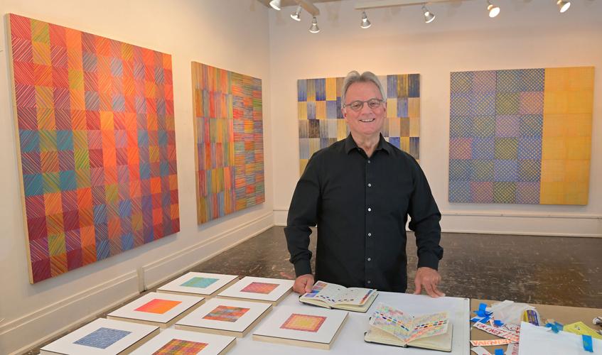
Jerome Hershey in his N. Queen St. studio on Sept. 17, 2021. Hershey celebrates 40 years of art-making in his studio with the release of a new book of paintings “Paintings: 2006-2021."


