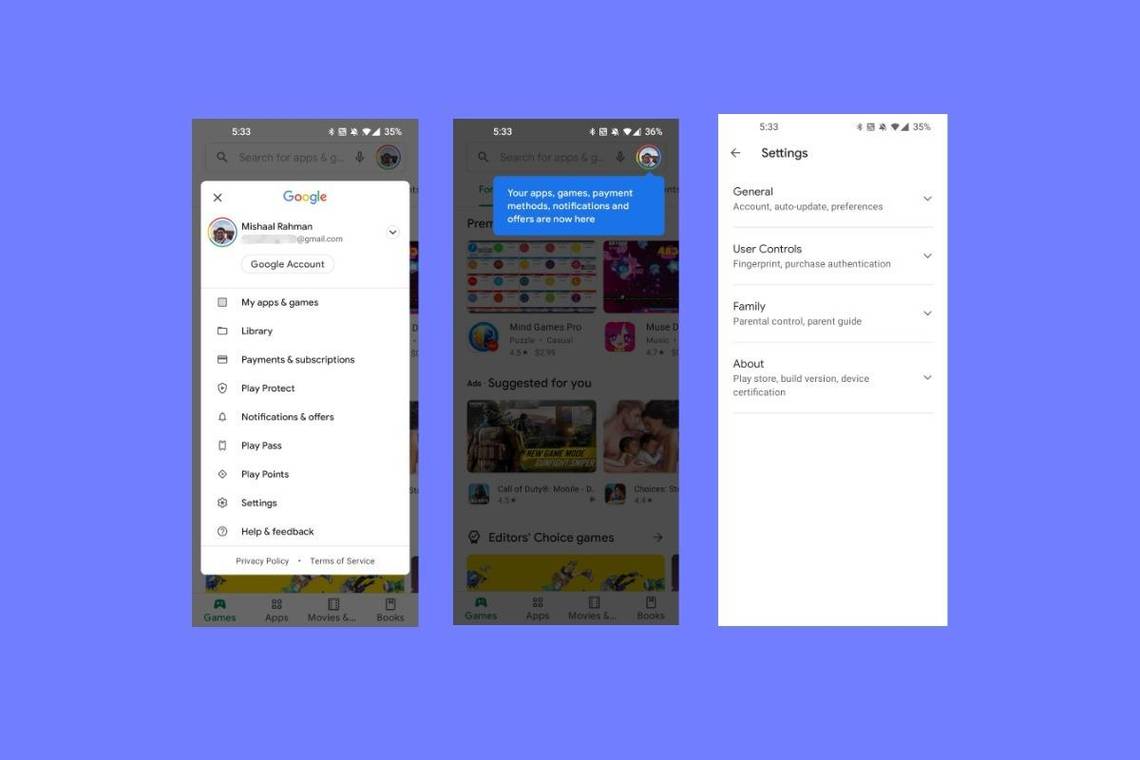
The latest Google Android app to drop the hamburger button is now the Google Play Store. Thank goodness Google is finally learning about better smartphone user interface design. Google Photos removed the design element last year and Google Maps removed it in 2019. The YouTube app removed it as well. Hopefully, the Gmail app, Google Drive app, and Google Calendar apps are next. If only we could get that awesome experimental Google Chrome user interface back too!
Why is the hamburger button such a bad design?
Oh my! There are so many reasons! Your first clue is in the name. If we have to make up a ridiculous name to describe an interactive element, that means the designer failed miserably in creating a button that clearly communicates its function. Every time you call it a hamburger button, you’re insulting whoever put it there.
We’ve actually talked about this before numerous times, (see: What’s wrong with hamburger buttons?), but we can summarize again.
- People don’t know what it does. There’s no indication as to what it’s supposed to be and what it’s supposed to do other than “something”. This is because people don’t understand icons. They do, however, understand words, because we learned about words at an early age and almost all humans have been taught about words for hundreds of years. It’s a really good way to communicate. See:
- It’s often used inconsistently. The hamburger button might be used for one type of thing in one app and another type in another app. There’s no consistency and therefore no way for a user to predict what’s it’s going to do. I’ve seen some apps with multiple hamburger buttons, maybe one at the top and one at the bottom, and they both do completely different things. That’s not user-friendly at all.
-
Placement at the top is the worst possible location for interactive elements. Also, see:
- 8 ways to tell if your mobile app sucks
- Why a top-edge screen gesture doesn’t belong on a smartphone
- Responsive Navigation: Optimizing for Touch Across Devices
- How Do Users Really Hold Mobile Devices?
- How to design for thumbs in the Era of Huge Screens
- The Thumb Zone: Designing For Mobile Users
- Designing for Large Screen Smartphones
- Why Mobile Menus Belong at the Bottom of the Screen
Our 2014 & 2015 articles about this were mainly targeted at Microsoft for implementing hamburger buttons in Windows 10 Mobile and Windows 10. I believe this poor design decision is part of what contributed to the fall of Windows 10 Mobile as all of the data seems to show that hamburger button-based user interface designs have reduced engagement and reduced usability. See:
- Kill the hamburger before the hamburger kills you
- A button that has the word “menu” is clicked 20% more than a hamburger button
- The hamburger is bad for you
- Why and how to avoid hamburger menus
- Apple says don’t use hamburger menus on iOS
- Time Magazine had to launch a tutorial pop-up explaining the hamburger menu
- Why we banished the hamburger menu
- Hamburger buttons could be costing you half of your user engagement
- 3 Good Reasons Why You Might Want to Remove that Hamburger Menu from Your Product
- Hamburger Menus and Hidden Navigation Hurt UX Metrics
Okay, okay… I know what you’re saying, “But Adam, the Pocketnow mobile website has a hamburger menu at the top! Hypocrisy much?” I know, I know, but my excuse is that I didn’t design this site, and the person who did doesn’t read my articles about user experience design or the advantages thereof. It looks like Google does read them though since they’re definitely moving towards a better user experience design among their apps.