20_PrimaryColors_2568x1444_v1

There's not a person who lives in the Seattle area-or even visits for a few hours-that doesn't find herself gazing at Puget Sound waters. We see our dreams in all that blue. It chills the bones thinking just how deep it descends. Seattleites lose track of how many different looks and shades and moods the blue sea can serve up.

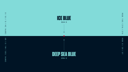
That's one reason why the Seattle Kraken's team colors lineup features not one, not two, not three but four entries of blue. The darkest blue is the team's primary color and just a puck-width short of black. "Boundless Blue" speaks to the vastness of beauty and fury that surrounds us. "Shadow Blue" fills out the blueness of the Kraken colors with important nuance and, to put it in hockey terms, a hue not afraid to work the corners and creases of the beveled Kraken's "S" logo. Ice Blue covers both water and mountain meditations or expeditions-take your pick-and is used in the secondary anchor logo (coming soon to the shoulders of players' jersey).

The naming search process actually began six months before an NHL franchise was awarded to Seattle and majority owner David Bonderman on Dec. 4, 2018. In early July, John Rizzardini, executive vice president of business operations and Heidi Dettmer, VP of marketing, met for an exploratory lunch with representatives from Adidas, the NHL's official uniform designer. What started at more than 1,200 name suggestions reduced to about 30 by mid-2019, then six by late 2019.

While color combinations were pondered and even debated over that span, the naming group members embraced a discipline not to introduce much color to working designs. The rationale is color itself can influence how we feel about a name or design. Only when the names nomination trimmed to a half-dozen in later 2019 did the color work begin in earnest.

"The names and marks and colors all work together," says Ron Francis, the Kraken's first general manager who joined the name game last July upon his hiring. "I think the colors are cool and certainly tie into the Northwest."

adidas designers get deep into the Kraken colors

True blue statement from a Hockey Hall of Famer who started his career with the Hartford Whalers, since moved to Carolina and renamed the Hurricanes but forever a franchise beloved for the Whalers distinctive jersey logo and colors. When Francis and former teammates such as three-time Stanley Cup winning coach Joel Quenneville travel to NHL arenas, they frequently see fans in Whalers gear.

Fun fact for nautical buffs: Francis was drafted and played for the Whalers, won two Stanley Cups with the Pittsburgh Penguins and captained a Stanley Cup Final team for the Carolina Hurricanes, a team he later served a general manager. The Kraken fits.

The Seattle working group knew their color work demanded a firm nod to nature. What's more, during fan interactions sessions that numbered more than 50, the fans made it abundantly clear they anticipated and wanted blue among the team colors.

"Just like the name, the colors are informed by the fans," says Heidi Dettmer, vice president for the Kraken. "Along with in-person fan sessions, we did a lot of social listening. Fans wanted blue or green with undeniable passion. Once we decided the name was 'Kraken,' it makes total sense to go with blues inspired by our Puget Sound waters."

"We wanted a color scheme Seattleites recognize as theirs," says Nic Corbett, director of NHL relations for Adidas, official jersey designer for the league. "The city shimmers, it's majestic when you drive or fly into Seattle. It's practically overwhelming."

adidas designers get deep into the Kraken logo

As a native of the Pacific Northwest, Adidas' design director for hockey, Matty Merrill, was fully aware of colors as an indelible pivot point for regional fans. Get it wrong and get out of town, buddy, don't hike our mountains or paddle our waters.

"Color is the first way fans are going to interact with this brand," says Matty Merrill. "Whether you see it from a distance or up close, it is the simplest way to communicate. It had to make sense for Seattle and it had to make sense for hockey and professional. But it also needed to be fresh and different."

Merrill, Corbett and other Adidas colleagues took color field trips of sorts from the company's Portland headquarters. One visit to Seattle in particular galvanized the multiple-blues approach in Merrill's creator's mind.

"There was the bluest sky and the Olympics mountains] showed an icy blue at top and the rocky gray at the base," Merrill recalls during an [Video: adidas designers get deep into the Kraken colors. "Then you see the blues of Puget Sound, just a spectrum of tones of blue. I thought, 'wow, why don't we do something with that."

Merrill envisioned the sea but also more water descending from the mountain snow: "If you look at the 'S' logo, there is a mountain shape at the top. I wanted to show water movement. So water is flowing down [the 'S'] and the Kraken's tentacle is reaching up to pull down the opponents."

adidas designers get deep into the Kraken sweater

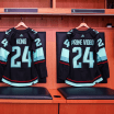
Three of the four Kraken blues are in the primary 'S' mark: The dark blue will be the primary color of the home jerseys. The lightest blue on the 'S' is called Breaker Blue to signify the color blue we see dancing on top of the waves when pondering the sea on a coastal walk, ferry ride or the hundreds of other ways we meditate on our waters. The medium-tone blue, called Shadow Blue, works to highlight both the darker and lighter blues.

A fourth blue, Boundless Blue, is the grayest of the Kraken quartet and replaces the Shadow Blue in the secondary logo, which is an anchor with the Space Needle chiseled in. The players will sport those anchors on their shoulders on both home (not a speck of white, which is highly unusual) and away jerseys.

"I think of the Ice Blue as that bright blue we see when the sunlight breaks through the water," says Merrill. "The blues are all complimentary of each other."

There is one more color, of course, in the logo and uniforms. Identified as "Red Alert," Merrill says the red eye of the logo gives a "hint of the beast" and the thinner red lines in the jersey and socks signify that power is always lurking beneath the surface.

The team's brand website gives a few more vexing details: "If you've seen it, it's already too late. The eye of the Kraken has been affixed on its prey for some time. Its strike will be swift and devastating, its opposition overwhelmed and unwary."